Introduction
A well-designed Gym Catalog Cover is more than just a visual introduction; it’s a marketing tool that defines your gym’s brand identity and influences potential clients’ decisions. In the competitive fitness industry, the first impression matters immensely. Your catalog cover is often the first thing customers see, and it can either invite them in or drive them away. Creating an appealing, informative, and brand-focused cover requires a combination of design knowledge, marketing insight, and creativity. This article explores expert advice, proven design techniques, and practical tips to help you craft a gym catalog cover that stands out and converts viewers into loyal members.
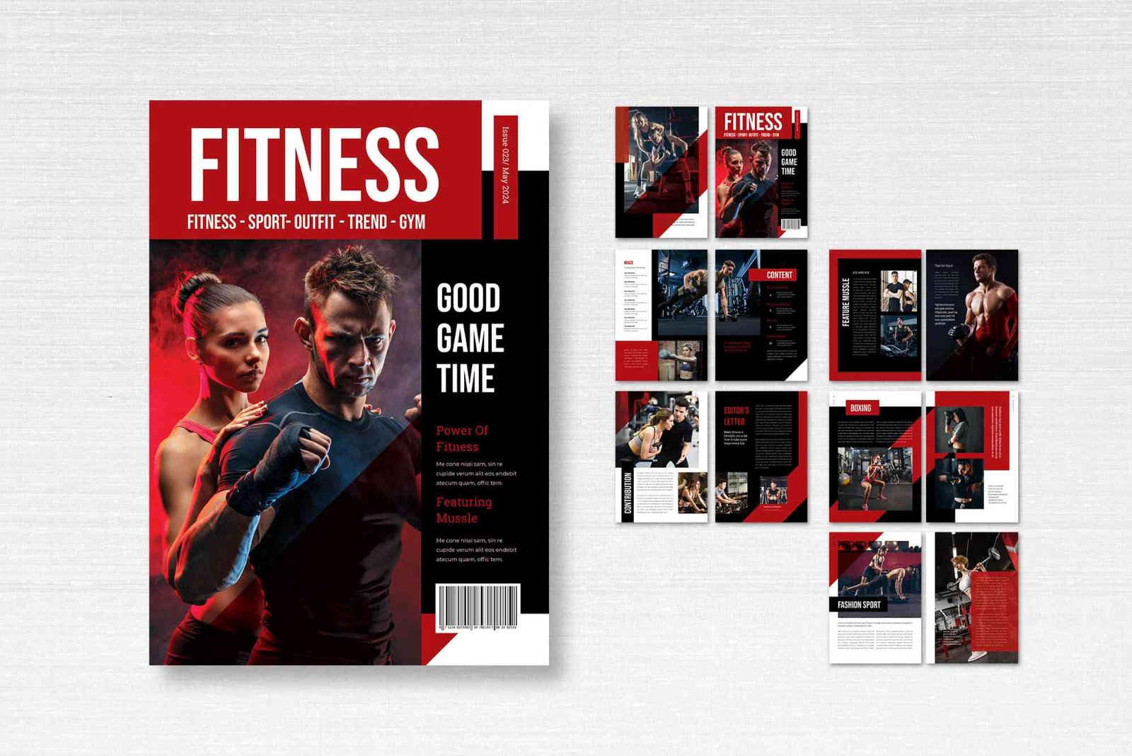
The Importance of a Gym Catalog Cover
Your catalog cover acts as the face of your fitness brand. It represents your values, energy, and professionalism. A visually strong design not only attracts attention but also sets the tone for what customers can expect inside. Whether your catalog promotes membership plans, training sessions, equipment, or apparel, the cover communicates credibility and motivation. In marketing terms, it’s your silent salesperson — working 24/7 to promote your business.
A great Gym Catalog Cover builds trust, reflects your brand identity, and inspires action. It can also serve as a consistent branding tool across online and offline marketing materials, from brochures to social media campaigns.
Key Elements of an Effective Gym Catalog Cover
Strong Visual Hierarchy
Visual hierarchy helps guide the viewer’s eyes from the most important information to the least. Your gym’s name or logo should take the top spot, followed by a strong image and a compelling headline. Use font size, color contrast, and spacing to make the key elements stand out without overwhelming the reader.
High-Quality Imagery
Use professional photography that highlights fitness energy, motivation, and transformation. Action shots of athletes, trainers, or clients in motion create an emotional connection with readers. Avoid overly staged or stock-looking photos; authenticity builds trust.
Color Psychology in Design
Color plays a huge role in creating emotional impact. Red and orange symbolize energy and action, while blue and green communicate trust and health. Choose a color palette that aligns with your gym’s theme. For example, a strength-focused gym may use bold, intense colors, while a wellness center might prefer calming tones.
Typography That Speaks Strength
Typography should reinforce your message. Strong, clean fonts communicate power and confidence. Avoid too many font styles; instead, use one primary and one secondary font to maintain visual consistency.
Branding Consistency
Your Gym Catalog Cover must align with your gym’s overall branding strategy. Include your logo, tagline, and color palette consistently. This builds recognition and loyalty. People should instantly associate the design with your gym.
Expert Design Tips for an Outstanding Gym Catalog Cover
Use Minimalism to Your Advantage
Less is often more in design. A clutter-free layout allows your key message to shine. White space creates balance, helping the reader focus on what truly matters — your fitness offerings and brand promise.
Focus on a Single Compelling Image
A single, strong visual can be more powerful than a collage. Choose an image that embodies your gym’s purpose, such as strength, endurance, or transformation. Ensure it’s high resolution and well-lit.
Include a Motivational Headline
Your headline should inspire readers to open the catalog. Use phrases like “Transform Your Life,” “Stronger Every Day,” or “Unleash Your Potential.” Keep it short, impactful, and relevant.
Balance Emotion and Information
While design triggers emotion, the cover must also convey essential information such as your gym’s name, contact details, or a website. The trick is to balance aesthetics with utility.
Consider Seasonal or Thematic Designs
Updating your Gym Catalog Cover periodically keeps it fresh and relevant. For example, a “New Year Fitness Goals” edition or a “Summer Body Challenge” theme can attract specific audiences.
Practical Advice for Gym Owners and Designers
A gym catalog is not just a design project; it’s a marketing strategy. Here are practical insights to ensure your design aligns with business goals.
Understand Your Target Audience
Before you start designing, ask: Who are you targeting? A catalog for bodybuilders will look very different from one aimed at yoga enthusiasts. Define your demographic clearly — age, gender, goals, and interests — to create a cover that resonates with them.
Align with Marketing Objectives
If your goal is to promote new memberships, highlight offers or transformations on the cover. If you’re showcasing equipment, make it the central visual. Always tie design decisions to marketing outcomes.
Use Professional Design Tools
Invest in high-quality design software such as Adobe InDesign or Canva Pro. These tools offer templates, grids, and typography control that help achieve professional results.
Collaborate with a Photographer
Instead of relying on stock images, hire a photographer who understands fitness environments. Real gym shots, members’ success stories, and trainer portraits make your catalog feel authentic and inspiring.
Optimize for Print and Digital
Ensure your cover looks great both in print and online. High-resolution images are essential for print, while web versions should be optimized for fast loading without losing quality.
Common Mistakes to Avoid
Many gym owners fall into common traps when designing their catalog covers. Here are a few to steer clear of:
-
Overcrowding the design with too much text or imagery
-
Using low-quality or unrelated images
-
Ignoring brand consistency
-
Forgetting to include contact or social media details
-
Neglecting to proofread text or verify design alignment
A clean, professional look always outperforms a cluttered one. Simplicity and clarity convey confidence and reliability.
The Role of Branding in Gym Catalog Covers
Your catalog cover is an extension of your brand story. It’s an opportunity to showcase your gym’s values — dedication, empowerment, and community. A strong brand presence on your cover builds emotional connections. Use your logo and tagline strategically, ensuring they blend naturally into the design rather than appearing as afterthoughts.
If your gym emphasizes community, show people training together. If you focus on elite performance, use imagery that conveys intensity and achievement. Every design choice should reflect your brand’s personality and promise.
Creating Emotional Connection Through Design
A successful gym catalog cover doesn’t just show — it makes people feel. Emotion drives action, and a design that evokes motivation, inspiration, or belonging can persuade potential members to engage. Highlight transformation stories, smiling faces, and powerful quotes that reflect your gym’s ethos. Visual storytelling through a single impactful image can spark curiosity and commitment.
Digital Integration: Linking Offline and Online Marketing
In today’s fitness industry, your catalog cover should also drive digital engagement. Add a QR code or website URL to guide readers toward online membership options or social media pages. Encourage interaction and make the transition from print to digital seamless.
You can also align your catalog visuals with your digital campaigns. When users see the same theme across your website, Instagram, and posters, it strengthens brand recall. For more guidance, explore Gym Catalog Cover design ideas that merge creativity and strategy effectively.
Measuring the Effectiveness of Your Catalog Cover
Once your catalog is distributed, track its impact. Ask clients how they found your gym — did the catalog play a role? Analyze website visits or QR code scans tied to the catalog. Customer feedback and performance metrics help refine future designs.
Real-World Examples of Successful Gym Catalog Covers
Leading fitness brands often use dynamic imagery and motivational messaging. For example, some global gyms focus on showcasing diverse body types and inclusive communities, while others highlight professional athletes to appeal to goal-driven clients. You can Read more on www.self.com for inspiration from successful fitness marketing campaigns.
Design with Purpose and Passion
Your Gym Catalog Cover is not merely a design element; it’s your brand’s ambassador. A thoughtfully crafted cover builds trust, inspires motivation, and drives customer engagement. When designed with strategy and emotion, it becomes a powerful marketing tool that fuels your business growth.
If you’re ready to transform your fitness brand through exceptional design, take inspiration from these insights and start planning your next catalog today. To dive deeper into advanced design strategies and creative trends, check out More Gym Catalog Cover ideas and elevate your gym’s marketing impact.
Frequently Asked Questions
1. What should a gym catalog cover include?
A gym catalog cover should include your gym’s name, logo, tagline, high-quality image, and a clear call to action.
2. What is the best color for a gym catalog?
Use bold colors like red, black, or blue to evoke energy and confidence, but match them with your brand’s color scheme.
3. How do I design a gym catalog cover if I’m not a designer?
Use templates from professional tools like Canva or Adobe Express. Focus on clarity, strong imagery, and consistent branding.
4. Should my catalog cover change seasonally?
Yes. Updating your cover for seasons or events like “New Year Fitness Goals” keeps your brand relevant and engaging.
5. How can I make my gym catalog stand out?
Use authentic images, motivational headlines, and a clean, modern layout. Make sure it reflects your gym’s unique identity and promise.